Final Images
The following images are the final three images for Brief 3.

Evaluation
Over the course of this project, my skills in portraiture photography have definitely improved. Through lighting and framing, I have been able to understand the fundamental creative values that go into a portrait photograph, and have truly been able to capture the image of a person, whether that person is explicitly showing something or not. In evaluation of the images above, I am mostly happy with how they have turned out. The self-portrait exactly captures the mood that I wanted to achieve, although the direction of the collar in the photo is slightly annoying as it is the only light area of the photo when the rest of the side of the face is in darkness. However, the use of lighting on this image is definitely how I wanted it to turn out, and for only a second attempt in using professional lighting for photography, it is certainly a very well-organised image. I decided to use a plain black background here because it gives a much better sense of fading into the background, which also works with the faded face light.
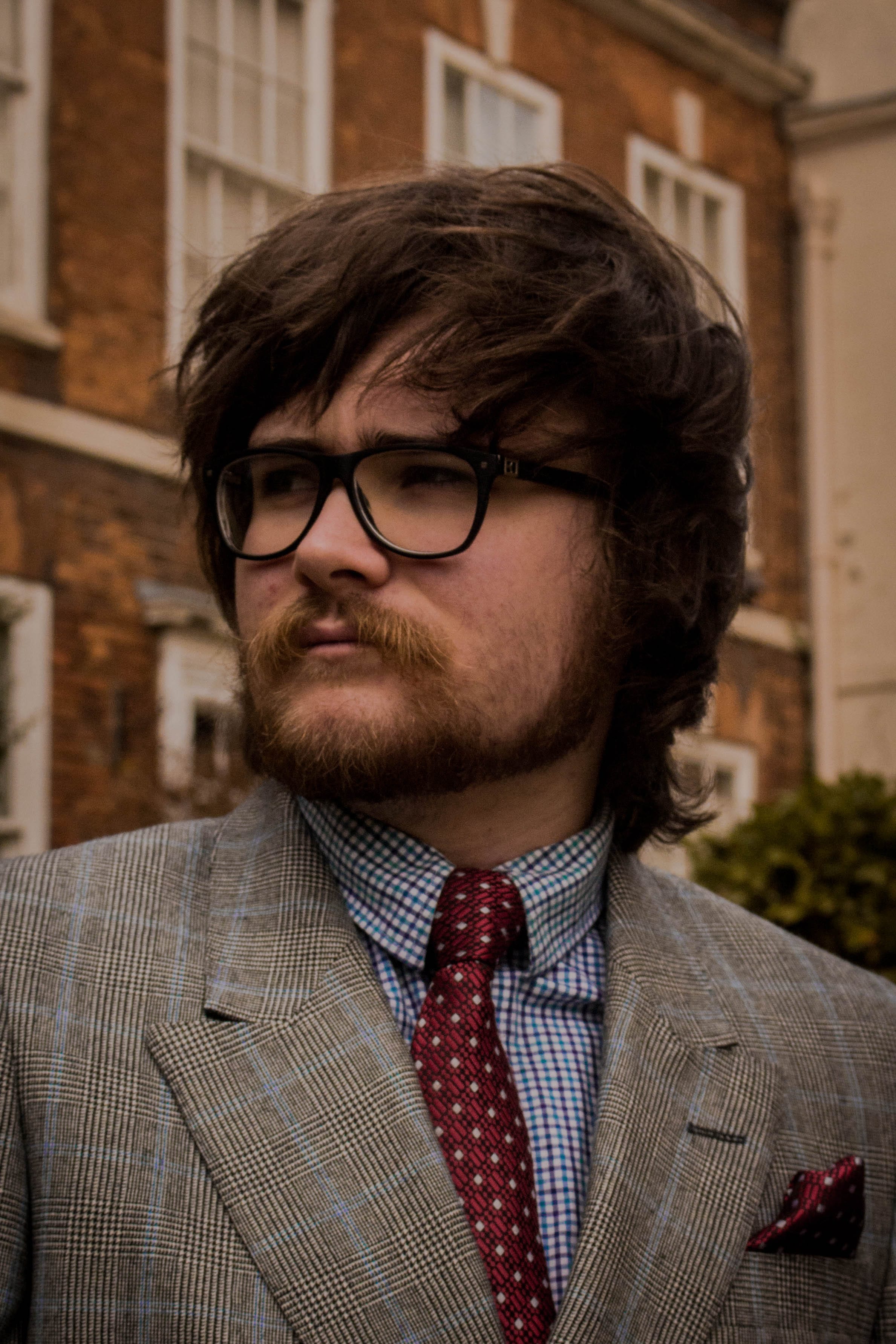
The second image, which is the portrait of a familiar, I am very pleased with. This is mainly because of the way the image is framed, with the subject standing in front of a Victorian terraced house. I think that if the subject were wearing a different outfit, or the background was a lot plainer, the image would not have worked in the way that it does. The natural lighting has also worked in my favour here, and I have edited the photo in LightRoom to reduce the highlights and deepen the shadows to create a moody effect. The stern look on the subject’s face also works well with the rest of the composition, and the photo is very similar to the work of Ray Roberts – one of the photographers I looked at earlier on in my research. The background of this image was chosen specially as I believed that it suited the subject’s facial expression and outfit. By placing them in front of an elegant-looking house, it gives both the subject and the whole photograph a whole new sense of importance.
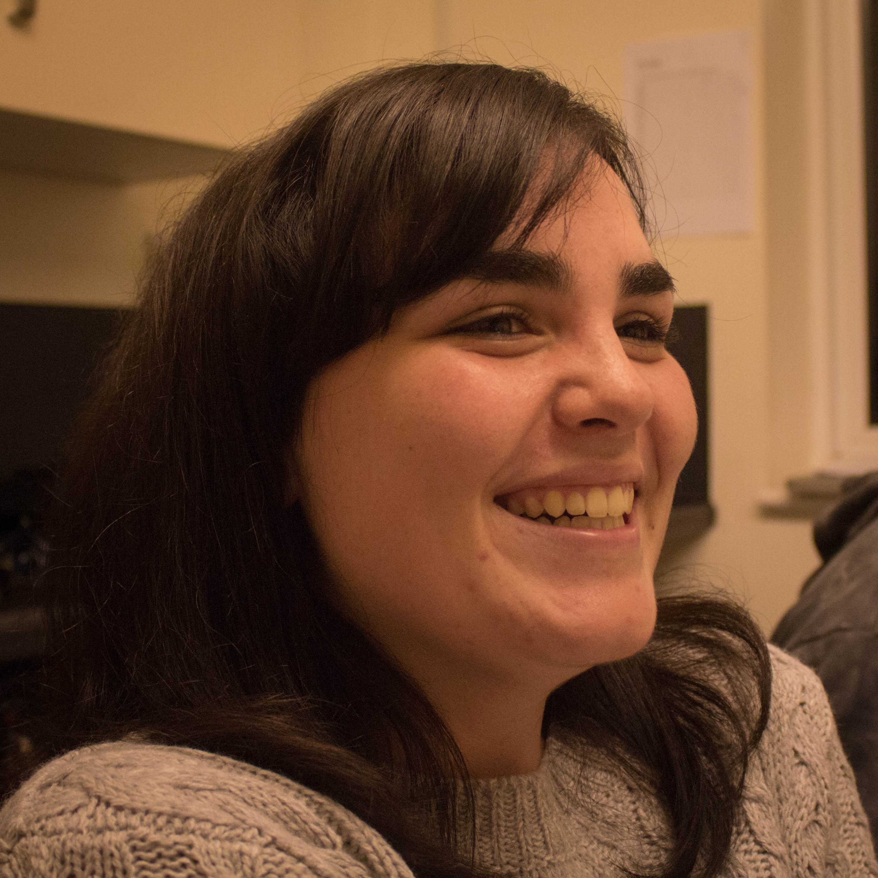
Finally, the portrait of a stranger is my least favourite of the photos I have taken. Only having a small amount of time to take the portrait and the lighting situation at the time of the capture were contributing factors in my displeasure with this image, although I have still framed it and edited to the best of my ability. A lot of the colour in this portrait is also similar, and there are no specific features that stand out. In the other images, the lighting on my face and the colours in Sean’s shirt and tie bring a certain vibrance to the image, whereas this image does not have any specifically redeeming features. It also does not especially fit the three images linked together, as the subject is mid-action and smiling, compared to the self portrait and portrait of a friend wherein the moods are a lot more serious. I think that if I had had a lot more time on this image, I could have made it a lot more interesting or of a higher quality. This background is also my least favourite, as the white paper, cupboard handle and edge of the window all interfere with what the eye is drawn to in the image. I think that this photo could definitely have been much better had I had more time to sit through and set up. Overall though, the brief has been achieved and I have definitely developed my skills within portraiture photography.