Concept
The second brief, entitled The Found Object, is a still life project wherein I had to go out and find items that could be presented in an interesting way. I decided to start my hunt for items by looking around various charity shops in Lincoln for interesting items. As I was collecting my items, I found the common theme of ‘foundations’, which I then went on to develop in my work.
The first that I came across was a small, early 20th Century candlestick holder with a golden handle. I was drawn to this item because of its interesting shape and design on the handle. I thought that it could be related to the foundations of lighting in the home. Although light had already been available to have in the home for a long time, this item could serve as a coverall to the accessibility of light being able to be in the home.
The second item I discovered was a blue/white vase in the traditional Chinese porcelain style. I was drawn to this item because of its links to the traditional Chinese culture, and how the foundations of these designs went to to influence the Western World in terms of art and design.
The next item I came across was a large screw, which I found outside a Victorian warehouse on the Lincoln Industrial Estate. This item intrigued me because of its shape and its potential links to the foundations of modern engineering in Britain.
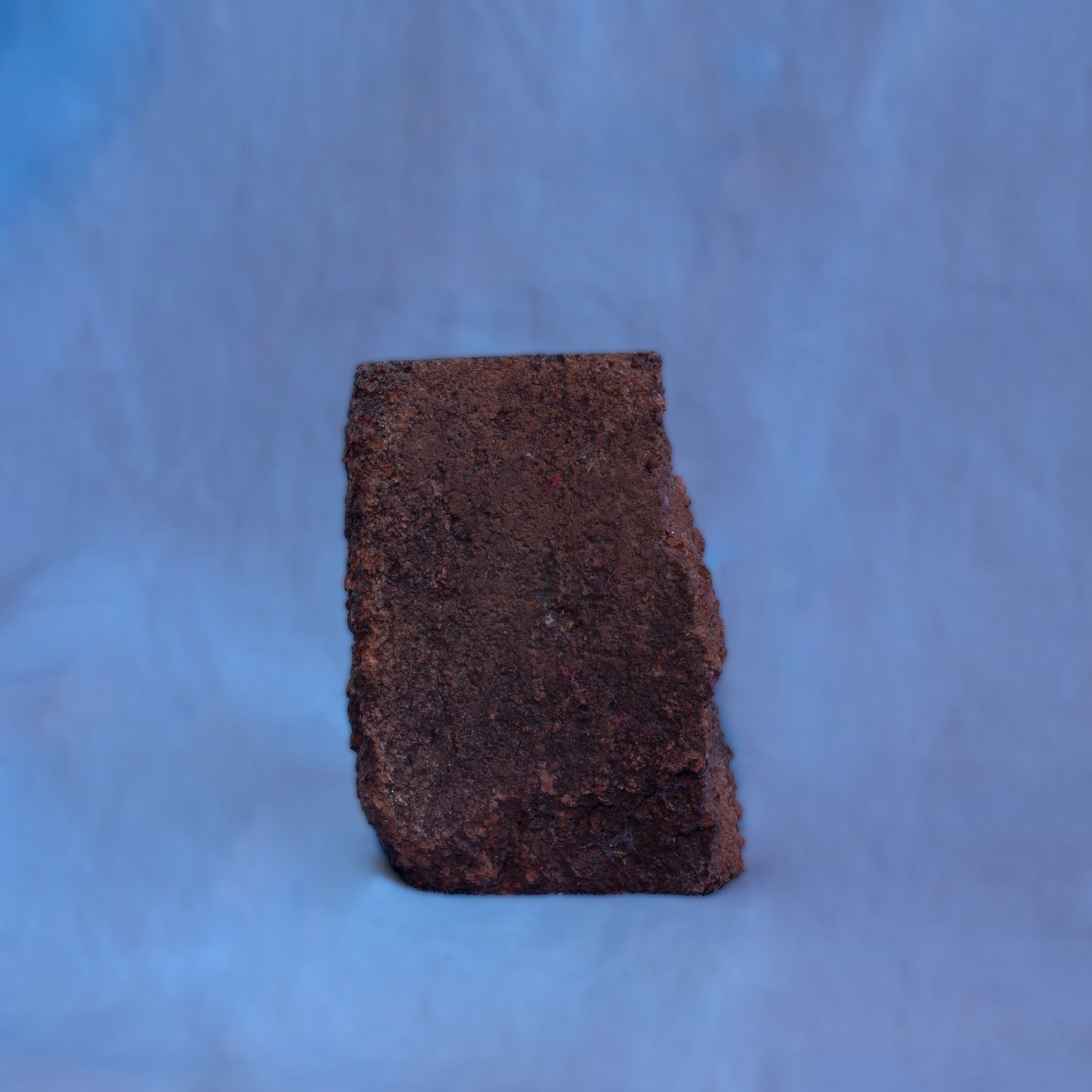
Finally, the last item I collected was a brick which I discovered in the graveyard next to the Lincoln Quaker’s Church. This brick was of a very old design and looked to be as if it was once part of the building. I found this item interesting as I thought it could link to the foundations of the church and had since been left to decay in a bush surrounded by gravestones.
Influences & Research
When looking at the shape and form of an item, a photographer I looked at was Don Freeman, who uses a contrast of colour to really bring out the form of an item. In the examples below, Freeman has shown the curvaceous form of a spoon and two vases on a platform which mirrors their form as well. The interesting contrast here in terms of colour is actually exactly what the photographer has wanted us to look at, stating “I feel I can represent the spirit of [an item] by observing how the daylight reveals its secrets…why we find perfection and beauty in it.” Following this, Freeman also states that the way in which an item is lighted can tell you a lot about it, which is why I spent such a long time on my own lighting setup (see above).


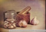
When looking at the background of my imagery, I decided that I didn’t want a plain background and instead had something with an interesting texture to it. A photographer whose work I enjoyed for its interesting background choices is Tom McNemar. McNemar, while some would say uses plain backgrounds, actually creates unique textures to his photographs, which mirror that of what is being presented. The image below on the left shows very autumnal products, including a lantern and a branch. The background of this image therefore shows a brown, also-autumnal texture, which brings together the image. This is then very different to the image on the right of the garlic cloves with mortar and pestle, which is a much brighter, smoother background. In my piece, I wanted to work something out that would mean the background represented the images represented, and therefore decided to use a bright, open background. This allowed for me to connect to the meanings that I had already established, as I was giving each item a new, fresh meaning, completely disregarding any previous use that the item may have had. My background also resembles the backgrounds that a lot of old, traditional portrait photos use, showing that even though I have tried to give these items a new life, there are still some elements of my work which conform the final work to a traditional photography standard.

Taking Initial Photos
I started working on what settings were best for my final photos by taking a walk around Lincoln and experimenting with the different settings. By looking at items either up close or far away (and especially given the lighting conditions I had, being an evening walk), it forced me to look further into what settings were best for the time of day and distance from the subject.


Process
Once I had all of my items, I decided to photograph them on a standard background. For this, I decided to use a blue sheet. This gave me a nice texture in the background, stopping the image from being completely plain. I lit this using natural light to the right of the image, combined with a reflector on the left to balance shadows and highlights. I also placed a pose-able lamp in front of the subject, which hung above the camera to give direct light onto the subject. This lighting setup allowed for me to get a full control over the placement of shadows in my image (although I did edit this further when the images were placed through LightRoom at a later stage). I also decided that it was best for me to place the images face-on. By shooting at this angle, I was able to look at the items how they would naturally be displayed, preventing any images from being seen at at unnatural angles. It also allowed for me to fully display the shape of the item, which was one of the contributing factors for why I chose a certain item.


Editing in LightRoom and Photoshop
The first editing I did was to put the photos through Lightroom. This allowed for me to adjust the settings of each photo, reducing the exposure and highs of the image, allowing myself to get more details in the form of darks and shadows. This made it much more fitting for the entire theme, as I had decided to try and make my images look slightly moody where possible.
In Photoshop, I put the images to a 1:1 aspect ratio so that they would fit the triptych later down the line. I also decided to remove the creases in the background so to make it appear smoother. With the candlestick holder, I also adjusted the angle so that it stood up straight – something I failed to grasp when taking the photos. Finally, I decided to blur out the backgrounds a little – using a Gaussian blur – to make the backgrounds smoother and allow the items to stand out more.


When I edited the final images together into the triptych, one of the issues I faced was that they were all at different heights and the backgrounds were a slightly different colour due to my editing in LightRoom. To fix this, I edited the images together in Photoshop to create a panoramic image, ensuring that the background colour was the same throughout, and that each item was presented at the same height. I then used created a white border for my images, ensuring that the sizes of each segment were exactly the same, creating the perfect triptych. I also added a vignette to the top corners of my image, which creates a clearer arch to the image. This was then saved as a new image, which is presented below.

Leave a comment