Concept
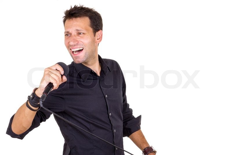
When presented with this brief, I wanted to show a contrast that completely flipped the representation of the original image and created a new image entirely. My original idea was to take elements of machines that have aided humanity and turn them into a new ‘machine’ that looked like it would actually be unhelpful or destructive to humanity. However, with this idea, it was hard to create something that looked as if it was menacing, as well as creating another contrast in the second image. Because of this struggle, I decided to look at other contrasts that would be less complicated to present. One of the more obvious contrasts that exist, is that of ‘good’ and ‘evil’, which lead me on to the topic of politics. My first attempt at changing the meaning started with a photograph by photographer Gordon Tant, that showed a woman singing at an indie music festival. The original image, although does not say it, projects themes of happiness and freedom. I thought it would be a good idea to try and reverse these themes, by changing the image to promote misery or anger alongside conformity and military.


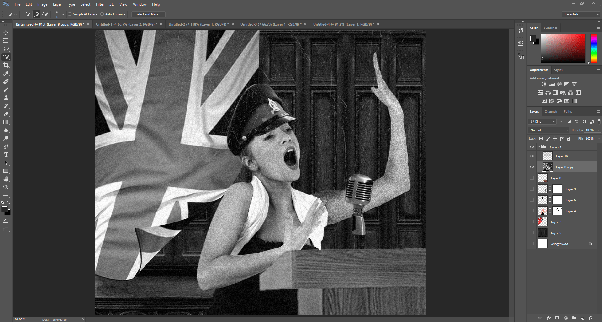
After I had created this first idea, I decided to create two more images which would contrast each other, while still changing the meaning of the original images. Looking at famous conflicts, I came to the events of the Second World War, an the rivalry between Britain and Germany. This clash between the two countries inspired me to take two images of singers from stock photo websites, and edit them as if to show them presenting speeches for both countries.
Editing Process
I started by looking through stock photos for images of singers that could be cut out and edited simply.

The first step to creating the new image was to cut out the two people and make sure that the lines surrounding them were smooth. This would be important as it can make the final image look both realer and more professional. I achieved this by selecting each person with the Quick Selection tool in Photoshop and, once each person had been fully selected, I feathered their outlines to ensure the smoothness.


Once I had each image how I wanted them, I then added the backgrounds and other features, such as medals, microphone and hats which built the image up more to a realistic look. I decided to put the flags of each army behind the singers, which further solidified the meaning of the new image.

After I had got each image to a standard I liked in colour, I decided to change the whole image to look as if it were a photograph from the 1940s. This was important as it meant that the image could represent the meaning even more and be easily understandable as, in colour, this could look like a modern conference, whereas I was aiming for one in the Second World War. This was achieved by putting the entire composition into black and white, adding noise and finally adding scratches to the image to show that they had been processed like film and had suffered from time.
Influences
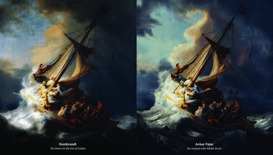
One artist that uses stock photos to create a new image is Ankur Patar, an Indian digital artist, who recreated an entire painting using just stock imagery, after the original image was stolen in 1990. Patar used a mixture of digital blending techniques to put imagery together to create a larger image. Similarly, I wanted to mirror this style in my piece, although did not use as many techniques as Patar. From the example (see below), Patar has successfully created a copy of the painting (although some details are obviously different) using all imagery that has been in the public domain. I have done the same with my piece, although not to the same professional standard as Patar.
However, not all artists use stock photography. Christophe Gilbert is a photomanipulation artist that creates all kinds of peculiar environments using existing images, compiling them for a new composition. Traditionally a photographer of cars, Gilbert now takes multiple images (sometimes his own photography, others not) and produces all sorts of landscapes or portraits for a variety of companies. Working for LG Electronics, Gilbert needed to show the high definition of the televisions that the company sells. This was represented by having an elephant perched in a tree, looking out over the horizon, which is bored by an LG television screen, showing that the televisions have a high quality and are large in size (although obviously not as large as that which is portrayed in the image).

For a reflection of my work, please see the ‘FINAL IMAGES’ page.
Leave a comment