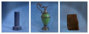
Final Images
This triptych is the final image for Brief 2.

Evaluation
This was an interesting project to embark on, as I did initially struggle on how to make three random images relate to one-another in an interesting way, while still presenting them in a triptych formation. I would say that I am mostly happy with my final image, as I have managed to take three completely random items and turn them into something interesting and new. The shape of each item is captured very well and the lighting is well-balanced, preventing any unwanted shadows from forming. This project also allowed me to develop my skills in LightRoom to a much better extent, as I could work with fine details that I would not have been able to previously do in Photoshop. Additionally, this project taught me a lot more about image form, and how each item within a photograph must be framed in a suitable way in order for the image to artistically work as a piece of media. Without these rules, I would not have been able to create the final image how I have done, although I still think there is room for some improvement.
While the final piece is something I am happy with, there are a few elements of the picture – some more controllable than others – that I would have changed had I done this project again. The first issue I have is that the vignette (one of the final elements of the piece that I added) is too obvious, and does not fade in a smooth manner. Instead of framing the corners of the image to create an archway, it instead creates a block of darker colour, distracting the eye from the images in the centre of each frame. I also am a tad unsure about the height of each item, with the candlestick-holder being a lot taller than the two other items. The handle of the image is also very close to the top of the frame, although if I made the whole frame taller, the brick and bolt would be too far away. The brick’s height, while not possible to change, is also slightly different to the bolt’s which does not create a pleasing line through the centre of the image. Finally, I think I might have changed the item where the bolt is, as it is a similar colour to the background, and therefore the saturation of that frame appears a lot less than the other two.
Leave a comment